Wednesday, August 21, 2024

Creating for Fun - Part 3


Hello my dear crafty friends.  I am back with Part 3 of my Creating for Fun series.  I was highly inspired by a set of die cut floral cards created by my friend Michele.  I may have to do some shopping at the Stamp Market for the dies she used but for now, here are my versions.


My cards started with a previously clear embossed scrap of green cardstock.  I thought it would make for an interesting leaf design when die cut.  I loved the look so I pulled out additional scraps in different colors, stamped them in Versamark and then heat embossed them in clear.  These all became the basis for the die cut elements.  It's a wonderful alternative to designer papers.  I photographed them below for reference.


I carried the clear embossed theme onto my white panel backgrounds.  I think the completed card assembly is self explanatory however please leave me a note in the comments if you have any questions.    

Supplies:
Concord and 9th - Picked Posies die set
Embossed Cardstocks:
    MFT - Marbled Background stamp
    Hero Arts - Chain Linked Fence background stamp
    Hero Arts - Tropical Foliage background stamp
    Simon Says Stamp - Chunky Sweater background stamp
The Greetery - Opposites Attract stamp/die set

I appreciate each and every one of you who takes the time to visit my blog.  Until next time..... Happy Crafting!

Jules

Friday, August 16, 2024

Color Hues #93


Hello my crafty friends.  I'm here today to share my card created for the newest Color Hues challenge.  Tracey is our hostess this fortnite and she has chosen the fun color combination of Orange and Yellow.  I chose a spring themed thank you card but this combination is also perfect for fall cards.


The focal elements were die cut from white cardstock and blended out with Distress Oxide inks.  The background texture is from an embossing folder.  The sentiment was heat embossed in white onto a tag strip using the same color of orange as is the card base.  I did use some of the die discards to polka dot up my cute rain boots.  I wasn't sure about this color combo at first but the end result makes me smile.   

Supplies:
Spellbinders - Hand Drawn Scallops embossing folder
Spellbinders - Notched Corner Frames die set
Spellbinders - Essential Sentiment stamp set
Spellbinders - Rain Boot Bouquet die set
Spellbinders - Swallowtail Tag die set

I invite you to visit our blog for additional inspiration from my teammates.  We would love to see your card in our gallery!!! 

Thanks so much -

Jules


Thursday, August 8, 2024

Seize the Birthday #289


It's time for a new challenge over at the Seize the Birthday challenge blog.  Our new Topping, chosen by hostess JoAnn, is Cute Critters.  I have to admit upfront that my entire card was designed around these cute glasses.  


Like I said in the intro, I designed my card around these cute die cut sunglasses from Spellbinders.  I dug through my critter dies until I came across the perfect penguin for this set of spectacles.  I felt like this cold weather critter needed a beach vacation and voila, the card was born.  

The design is pretty straight forward.  I die cut from colored cardstocks and opted against any additional shading.  In hindsight the final product seems very flat in appearance but this will most likely go to a child who honestly won't care in the slightest.  The scene elements were adhered to a full sized A2 panel which was adhered to the card base.  

Supplies:
Cottage Cutz - Penguin with Present die set
Spellbinders - Smart Glasses die set
MFT - Beach Builder die set
MFT - Sunshine and Friendship stamp set
Simon Says Stamp - Brilliant Gifts die set

I invite you to visit our blog for more inspiration from my teammates.  Joining us are Karen (our latest Surprise Party Guest) and Darnell (the winner of the last challenge.)  Please give them a warm welcome.  

We would love to see your card in the gallery.  Critters are optional; birthday cards are not.

Thanks for visiting!

Jules


Tuesday, August 6, 2024

Creating for Fun - Part 2


If you recognize my first card, it's because I CASEd one of my recent designs.  I not only made another card exactly like my first but I also created additional cards in four more color combinations.  

Welcome back to my second post of "Just Because" cards....those I've made strictly for myself with no external restrictions.  Let's get to it, shall we?


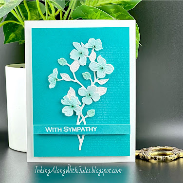
I began with panels of colored cardstocks.  I used white pigment ink and a text background stamp to lightly stamp the right side of the panel.  I edged the panels with darker shades of ink for some added interest.  (The exception is the black card where I edged it with white pigment ink.)  The sentiment strip was heat embossed in white.  The florals were all die cut from white cardstock and colored with coordinating colors of dye ink.  Gems/pearls gems/pearls were added to the floral centers for some added interest.  The panel was cut down to expose the white border of the card panel.  I did switch out the "sympathy" sentiment on two cards to a more universal "thinking of you" sentiment.

Supplies:
Honeybee Stamps - Lovely Layers Dogwood die set
Honeybee Stamps - black pearl stickers
Gina K Designs - Assorted Sentiments stamp set
Hero Arts - Novel Prose Bold Prints background stamp

Thanks so much for visiting my little corner of the blogosphere.  Your time is much appreciated.  Be sure to check back for more "just for fun" cards which will be coming soon.

Jules


Sunday, August 4, 2024

Just Us Girls Challenge #738


I am really enjoying my newly found free time lately and have been spending much of it in my craft room.  Today I am playing with the Just Us Girls blog with a color challenge.  I love this color combination so much that I made a two-fer.  We'll start with the one I am posting to their blog.


And now card #2.  I'm still on the fence as to which I like better.  


If these cards look familiar to you it's because it's a CASE of this card I created and posted last week.  In that post I mentioned how I wanted to create one in pink so this challenge gave me the push I wanted/needed.  

The construction is very straightforward.  The elements were die cut from colored cardstock (no blending) and adhered to a panel of pink cardstock and then layered again with a scalloped edge panel.  This is a very easy and fun technique that I hope you'll try.  

Supplies:
Erin Lee Creative - Layering Dahlia die set
Concord and 9th - Picked Posies die set (yellow center)
WPlus 9 - Sunshine Layers die set (scalloped frame)
Simon Says Stamp - Clean Lines Gratitude stamp/die set
Altenew - Bold Thanks die set

Let me know if you have a favorite!  And as always, thank you so much for visiting my blog.  Your support means so much.

Jules

Saturday, August 3, 2024

Sisterhood of Snarky Stampers #253


It's the first Saturday of a new month which means Edna has a new challenge for you to try.  The Sisterhood of Snarky Stampers is looking for Summer themed cards.  


Yeah, I know scuba diving isn't solely a summer activity but I've been waiting for an opportunity to use this gal and today was the day.  She'd be too cold to do this in winter.  *wink*


My biggest obstacle with this card was finding a suitable sentiment.  After many hours of searching my stamps (a slight exaggeration but not by much) I came across a set by CathyZ.  I thought it fit the mood perfectly.

I began by coloring in the images with Copic markers.  To create the undersea background I simply did some Distress Oxide ink blending onto a white panel of cardstock.  She needed some grounding (and I needed a spot for a sentiment) so I chose to die cut an oval sentiment strip for her to stand on.  (Sentiment is heat embossed in white.)  I added the clear droplets to simulate air bubbles.  Isn't she quite the adventurer?  

Supplies:
AALL & Create - Scuba stamp set 
Simon Says Stamp/CZ Designs - Sassy Insides 2 stamp set
clear droplets

We would love for you to join in on our challenge which runs all month long.  Snark is our passion but not a requirement to play.  I hope to see your card in our gallery!

Thanks so much for stopping by!

Jules


Thursday, August 1, 2024

Color Hues #92


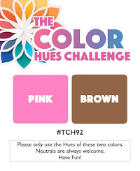
If it's the first of the month then it must be time for another color duo over at the Color Hues challenge blog.  Stef is our hostess and she's chosen a fun and fab color combo for us to play with.


I took advantage of a recent Concord & 9th sale and couldn't wait to start playing.  I adore these sunglasses but wanted to make them a bit special and unique.  I did so by blending the lenses in three hues of pink.  (I taped off the rows and blended with a brush before inserting them into the frames.)  The background is a blend of Distress Oxide pinks and browns.  I added a spritz of water when complete and am really digging the look.  It reminds me of soda...Strawberry Fanta on top and A&W Root Beer on the bottom. Yummy! I stamped and heat embossed the sentiment in white and popped the finished panel onto a white card base using fun foam.

I'm also adding this to Darnell's gallery.  NBUS no more!


Supplies:
Concord and 9th - Bright Eyes die set
Concord and 9th - Bright Eyes stamp set
Distress Oxide inks

I invite you to play along with us in the gallery and encourage you to check out my teammies creations on the blog.  

Thanks so much for visiting!

Jules