Saturday, May 29, 2021

Sisterhood of Snarky Stampers #186


Our prompt of Animals garnered a huge response in our gallery.  Thank you to all who played along with us at the Sisterhood of Snarky Stampers.  I'm expecting another great turn out for this fortnight's theme which is K is for Kraft-y.  


I have been wanting to use my Tim Holtz Christmas Cats since purchasing them last September.  This set is a Simon Says Stamp Stamptember 2020 exclusive that sold out immediately.  Once again, I had to have it but it's taken me nine months to actually use it.  (NBUS anyone?)


I added a snarky greeting from a different manufacturer but 
did use one of Tim's sentiments for the inside of the card.


Let's start with my kraft background.  I die cut a stitched panel from Neenah Desert Storm cardstock,  splattered it with several layers of thinned down white acrylic paint and set it aside to dry.  I die cut several evergreen boughs from green cardstock and arranged them onto the dried panel.  I stamped, Copic colored and fussy cut out my naughty kitty and adhered him to the boughs.  I adhered the panel to a heavyweight black card base and embellished the scene with some red jewels.  It seemed to be missing something so I added in the faux stitching with a white gel pen.  I thought the sentiment (an oldie that isn't labeled, sorry) was definitely appropriate.

Come check out our blog and give our kraft-y challenge a whirl.  We all love a good laugh so snark is much appreciated but not required to play.


Supplies:
Stampendous/Tim Holtz Christmas Cats stamp set
Shit Happens stamp set - not labeled, sorry  
Carta Bella - Joyful Pine die set
Little Things by Lucie - Rainbow Bright Diamonds


Continue to stay safe and healthy my friends.   _____________________________________________________________________________

Thank you for visiting my little crevice of the crafty blogosphere.  Your time, comments and friendship are much appreciated.  

Happy Crafting!

Jules 


Tuesday, May 25, 2021

CAS Colours and Sketches #421


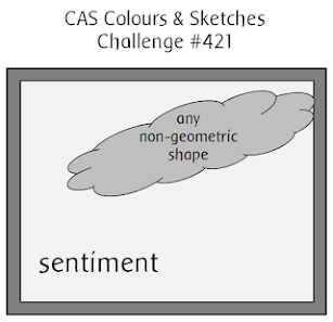
The last Tuesday of the month means a new sketch challenge over at the CAS Colours and Sketches challenge blog.  Samantha is finishing up her hostess duties with a very interesting design idea.


I definitely took advantage of our flip/rotate option this time around.  Ignore the backward text but I wanted to show how I flipped the sketch vertically for my card design.


That said, the angle of my image is a bit off but it's definitely in the right spot and definitely not geometric.  What makes this work is that these cute images are indeed just one stamp (and die).  All of the masking work has been done so in my book it counts as "any non-geometric" shape, as in singular.  (I can be the Queen of Loopholes.) 


With no masking to do this was a very simple card to make.  I stamped the image, colored it loosely with Copic markers and then die cut it out using the coordinating die.  I decided against any of the sentiments included in the set as I wanted to make this a simple birthday card.  I stamped the sentiment in the top left, added a bit of shading to the ground and adhered the image to the white panel which was then glued to a pink card base.  

I encourage you to think outside the box with our sketches.  Flip them, rotate them, heck...flip and rotate.  It's up to you.  I invite you to visit our blog and hope to see your card in our gallery.

Supplies:
Colorado Craft Company - Party Time stamp and die set
Waffle Flower - Essential Sentiments stamp set


Continue to stay safe and healthy my friends.   _____________________________________________________________________________

Thank you for visiting my little crevice of the crafty blogosphere.  Your time, comments and friendship are much appreciated.  

Happy Crafting!

Jules 


Sunday, May 23, 2021

Let's Squash It #8


I've had about three weeks without a major road trip which means more time for crafting.  It's been a bit since I've participated in the Let's Squash It challenge but I remedied that today with not one, but three cards.  The current embossing folder challenge requests that we leave some space and add some bling.  


I went with a cream/white/critter theme.  I didn't start out with the intention of creating multiples but I loved the result of this first one so much, I had to create more.


I began with some cream linen cardstock which I ran through my die cutting machine using a large embossing folder.  It's meant for a 5x7 inch card so it left lot of room when cut down.  I matted the panel with the tiniest of kraft cardstock borders.  I die cut the mouse and shamrock from white cardstock and used Copic markers to bring them some life.  I stamped the sentiment in the lower right corner, positioning the mouse above.  I adhered the panel to a white card base that I'd previously textured using a linen cover plat and then added in the tiny sequins to finish it off.  

Like I said, I loved the end result so I made two more cards in a similar fashion.  For this next one I used a hedgehog and snail from the same die set but in a horizontal orientation.  


I went back to the cute little mouse for the third card but with a different but similar sentiment.


These were so fun to make and would not have happened without the prompt.  This my friends is why I love challenge blogs!


Supplies:
Cottage Cutz - Forest Critters die set
Colorado Craft Company - Thank You Kindly stamp set
Creative Expressions - Forget Me Not Frame embossing folder
PaperTrey Ink - Linen Cover plate
PaperTrey Ink - Cream Linen cardstock
Honeybee Stamps - Jasper Chameleon sequins


Continue to stay safe and healthy my friends.   _____________________________________________________________________________

Thank you for visiting my little crevice of the crafty blogosphere.  Your time, comments and friendship are much appreciated.  

Happy Crafting!

Jules 

Friday, May 21, 2021

Flower Challenge #56


There are so many wonderful crafter/artists who can bring flowers to life through their amazing coloring skills.  Alas, I am not one of them.  I find coloring floral images to be extremely intimidating and therefore tend to avoid so many beautiful stamps in my collection.  Recently I put on my big girl panties and made a card for The Flower Challenge.   


I don't really have a favorite flower and quite honestly I couldn't begin to tell you the name of the floral I used in my design but that's between you and me, okay?  *wink*


I began by stamping my large floral image onto smooth white cardstock.  I find large images such as this less intimidating to color if I use a very loose method that leaves a lot of white space.   (Two shade of blue and two shades of green Copic markers with very little blending.)  I cut the panel down and then ran it through my die cutter with a trio of banner dies.  I then cut an additional five banners of each size from black cardstock which I used to layer underneath the floral portions.  I matted the white panel in black and then adhered the layered floral banner in place.  As you can see, this gives the card front a good deal of dimension and interest.  


I added this panel to a blue card base, leaving a nice border of blue visible.  I stamped the sentiment with Versamark ink onto a black cardstock banner and then heat set with white embossing powder.  I adhered it towards the bottom of the vertical banners, flush to the banners with black foam tape to shore up the edges.  I finished it off with my favorite clear droplets and am pleased with the results. 


Supplies:
Altenew - Delicate Bouquet stamp
PoppyStamps - Classic Ribbon banner set
The Ton - Basic Sentiment stamp set
Ellen Hutson - clear droplets


Continue to stay safe and healthy my friends.   _____________________________________________________________________________

Thank you for visiting my little crevice of the crafty blogosphere.  Your time, comments and friendship are much appreciated.  

Happy Crafting!

Jules 


Wednesday, May 19, 2021

Color Hues #18


For the record, I support my favorite challenge blogs even when they do choose the ickiest color on the planet.  I know purple is my friend Lindsey's favorite color however I think deep down she chose it because she knows how much I truly despise it.  *wink*  Thank goodness she had the decency to pair it with one of my favorites, teal.  


Color Hues


I was in the mood for something geometric and found this underused cover plate die in my stash.  I love all of the circles and it's perfect for the inlay technique.


I started by die cutting a piece of white cardstock with the cover plate to get the frame and circle borders.  I pulled two shades of purples and three shades of teals from my cardstock scrap bin and positioned the scraps onto the plate to give me the variation I wanted on the final panel.  Wanting a bit more interest I ran the five circles through a 3D embossing folder and I really like the texture this added to the final piece.  To assemble my card I adhered the white frame to the front of a heavyweight black card base.  I inlaid the textured circles, leaving places for the black card base to show through.  (Somehow the purples seem less gaudy when framed out in black.)  I cut my sentiment in white and layered it onto a black coordinating shadow die cut.  The finishing touches are some cute little white gems that recently found a home in my craft room.  I love them so much I will probably fostering a few more soon.  

Don't tell Lindsey but I reluctantly admit that being pushed from my comfort zone is sometimes a good thing as I kinda like the end result.


Supplies:
The Stamp Market - Circled Card Cover die
The Stamp Market - Great Big Thank You die
Altenew - Angled Mosaic embossing folder
Honeybee Stamps - white rhinestones
PaperTrey Ink and MFT - cardstock scraps


Continue to stay safe and healthy my friends.   _____________________________________________________________________________

Thank you for visiting my little crevice of the crafty blogosphere.  Your time, comments and friendship are much appreciated.  

Happy Crafting!

Jules 


Tuesday, May 18, 2021

CAS Colours and Sketches #420


It's time for another color challenge over at the CAS Colours and Sketches blog where the trio is a beautiful set of pastels.


For our color challenges, you must use all of the stated challenge colors. You may also use neutrals 
such as white, ivory, black, brown, grey, or metallics; however, no other colors should be added to 
your card. We use Stampin' Up color names for reference, but you are welcome to use any other 
companies' products as long as you match the challenge colors as closely as possible.


Without further ado, here is my card.


I began with the offset white card panel.  My flowing bouquet was actually created with the masking technique and multiple stamping of a single small floral cluster.  It's a fun way to get more use out of those tinier images.  I wanted an airy look to the image so I did some loose coloring with just three shades of Copics. I added a silver glitter edge to the "wonky" panel before adhering it to the lavender card base.  I stamped the sentiment with a crisp black pigment ink and added the trio of sequins to finish it off.   

I hope you'll stop by the blog and maybe be inspired to play along.  We'd love to see your card in our gallery!

Supplies:
Altenew - Sweet Clusters stamp set
Hero Arts - Peacock stamp set (sentiment)
PaperTrey Ink - Tipped Top Frame die set
The Ton - silver glitter washi tape
Pretty Pink Posh - Sparkling Clear Confetti


Continue to stay safe and healthy my friends.   _____________________________________________________________________________

Thank you for visiting my little crevice of the crafty blogosphere.  Your time, comments and friendship are much appreciated.  

Happy Crafting!

Jules 

Sunday, May 16, 2021

Seize the Birthday #214


Today's card was inspired by and created for the current challenge over at the Seize the Birthday blog where the topping is Bouquet.


I did some flipping through my dies and found a NBUS die set from Spellbinders which was perfect for my card.  (It always feels great to use those things we just had to have but have yet to use.)


I die cut all of the florals using white cardstock and then colored them with two shades of Catherine Pooler inks. I was very heavy handed with the Sangria color in order to achieve the deep rich plum color but varied the pressure of the Pink Champagne shade to get a bit of variation.  I alternated the colors between lights and darks when assembling the bloom stacks.  The "stem" is actually a leafy flourish die which was also die cut in white and colored with the Eucalyptus shade of CP ink.

I cut a half inch off the vertical edge of a subtly textured gray card panel to allow a bit of the white card base to show from the sides.  I arranged and adhered the floral stacks onto the flourish and then picked up the arrangement using a of Glad Press and Seal.  I added liquid glue to only the back of the flourish as it's the only piece that would be flush to the card base and then adhered the arrangement to the card front. I used little dots of liquid glue where needed to keep the whole thing in place.  The sentiment was heat embossed in white onto a strip of black cardstock and the card front was finished off with some glossy black and white enamel dots.  

I have found that I'm a better card maker than I am a card sender. *blushing in shame*  I've missed at least three birthdays in May but I'm hoping to rectify that this week.  This card may be postal before it even hits my finished card bin.

Supplies:
Spellbinders - Layered Colorful Blooms die set
MFT - Large Leaf Flourish die
Catherine Pooler - inks
Altenew - Versatile Vases stamp set (sentiment)
Neenah - Textured Cardstock

Continue to stay safe and healthy my friends.   _____________________________________________________________________________

Thank you for visiting my little crevice of the crafty blogosphere.  Your time, comments and friendship are much appreciated.  

Happy Crafting!

Jules 


Saturday, May 15, 2021

Sisterhood of Snarky Stampers #185


Thanks to all that played along with us last week.  Today marks the beginning of a new challenge for the next fortnight and this time around Edna and the Sisterhood would like to see some critter cards.  


Notice how Edna is trying her best to blend in? 


Before I show you my card I feel the need to justify my critters.  They are of the feathery type rather than the furry type BUT scientifically speaking, birds are of the Kingdom Animalia.  So...I'll give you three guesses as to my feathery focal point but I'm thinking you'll only need just one.  


Meet my party crasher.  :-)


I began by stamping, die cutting and coloring (Copics) my flock.  I did a bit of ink blending and tone on tone stamping for my background.  I really wish I'd pulled out my traditional Distress inks rather than the Oxides.  I feel like it's dulling my background and in an attempt to enhance it I got a bit over zealous with my splatters.  Oh well....  I adhered the back most flamingo and ostrich directly to the panel and popped up the remaining three flamingos as well as the sentiment banner which was heat embossed in white onto black cardstock.  The panel was adhered to a heavy weight black card base and finished off with my favorite clear droplets.  

I invite you to come visit us at the blog.  We'd love to see your snarky cards in our gallery however sarcasm is not required to play.  

Supplies:
WPlus9 - Flock Yeah stamp and die set
WPlus9 - Oh My Gostrich stamp and die set
Altenew - Freeform Greetery stamp set
Picket Fence Studios - Flocking Great stamp set
Ellen Hutson - clear droplets


Continue to stay safe and healthy my friends.   _____________________________________________________________________________

Thank you for visiting my little crevice of the crafty blogosphere.  Your time, comments and friendship are much appreciated.  

Happy Crafting!

Jules 


Tuesday, May 11, 2021

CAS Colours and Sketches #419


It's time for a new sketch challenge over at the CAS Colours and Sketches blog.  This week Samantha has chosen a mini slim line sketch for us to try.  


Feel free to flip or rotate the sketch when creating your card. 


I stayed true to the sketch and created this Thinking of You card.  


The finished dimensions of my card are 3.5" x 6.25" and in case you're interested, I purchase my mini slimline envelopes from Taylored Expressions.  This particular one is white but she carries a wide variety of colors.

My card base is Neenah Desert Storm 110 lb cardstock cut to 7" x 6.25" which I scored in half to create the finished 3.5" x 6.25" size.  The white panel, cut slightly smaller, was run through my die cutter using a diagonal lined embossing folder.  I created the sentiment strip with some leftover kraft cardstock, heat embossing the sentiment in white.  The butterflies are two layers.  The bottom layers were cut from kraft.  The top layers were cut from vellum.  I adhered the vellum to the kraft only at the center to give the wings some dimension.  My finishing touches were to add jewels to their bodies and then sprinkle a few around the focal point.  

I invite you to come check out my teammates cards.  Hopefully you're inspired to play along.  I'd love to see your card in our gallery!


Supplies:
Clearly Besotted - Butterfly Duo dies
Clearly Besotted - Sentimental Type stamp
HAI - rhinestones
Embossing folder - unknown, sorry 


Continue to stay safe and healthy my friends.   _____________________________________________________________________________

Thank you for visiting my little crevice of the crafty blogosphere.  Your time, comments and friendship are much appreciated.  

Happy Crafting!

Jules 


Saturday, May 8, 2021

Happy Little Stampers - May Anything Goes With Dies Challenge

It's time for a new monthly challenge over at the Happy Little Stampers blog where the only rule is to use a die on your card.  


I recently took advantage of a great sale over at The Scrapping Cottage featuring their Cottage Cutz dies.  I couldn't resist these little gnomes and certainly couldn't wait until Christmas season to use them.  


Aren't they just the cutest?


If you're not familiar with CottageCutz die sets you might be surprised to know that they come as all one piece.  I really like this feature since I'm constantly misplacing my pieces on my work surface.


The only "disadvantage" is that you either have to run this through your cutter multiple times with multiple cardstock colors or do as I did and run it through once with white cardstock and then Copic color each piece.  I enjoy the coloring process and find it therapeutic so I had a lot of fun with these.  I also love the assembly process.  It reminds me of Betsy McCall paper dolls that I LOVED as a kid.  (Anyone here old enough to remember those?)  I couldn't wait for my mom to finish the magazine so I could have the page.  :-)

After coloring and assembling each component I set to work on the scene.  I used patterned papers for the wallpaper and flooring and then stamped a sentiment onto the bottom center before adhering my gnomes.  I added a tiny white pom to the end of their caps to finish off the design.  


If truth be told, I probably won't be giving this card away any time soon.  It just makes me happy.

I invite you to come play along with us at the Happy Little Stampers challenge blog where there's a challenge to match everyone's taste.  We'd love to see your creations in our gallery!


Supplies:
Cottage Cutz - Baking Gnomes die set
Avery Elle - Brrrng on the Joy stamp set
Honeybee Stamps - Autumn Afternoon 6x6 paper pack
Neenah Solar White 110 lb cardstock
Copic - alcohol markers


Continue to stay safe and healthy my friends.   _____________________________________________________________________________

Thank you for visiting my little crevice of the crafty blogosphere.  Your time, comments and friendship are much appreciated.  

Happy Crafting!

Jules 
Tuesday, May 4, 2021

CAS Colours and Sketches #418


May has arrived and we have a new hostess this month at the CAS Colours and Sketches challenge blog.  Samantha has chosen a color trio based upon the 2021 Pantone colors of the year.


Here's my card based on this beautiful color combo...


The card front was created by using a cover plate die to emboss rather than cut. (A simple switch of your "sandwich" to include a rubber mat ensures that you get embossed lines.  Check out the manual of your die cutter for the correct plate combinations.)

I chose three colors of cardstock scraps in the challenge colors and ran them through my cutter using the plate in the traditional method to get the trio of diamond shapes.  I decided to do the same with a scrap of white cardstock.  I scattered the bits around until I found a pattern that pleased me. The Pantone colors were adhered flat to the panel but I did pop up a few white ones with foam tape.   The sentiment and banner were cut from dies and adhered to the right side of the card.  No embellishments needed.

I invite you to come visit our blog and hope you're inspired to play along.  
 

Supplies:
The Greetery - Square Dance background die
Pinkfresh Studios - Basic Labels Frame die set
Altenew - Tall Alpha Lower Case die set


Continue to stay safe and healthy my friends.   _____________________________________________________________________________

Thank you for visiting my little crevice of the crafty blogosphere.  Your time, comments and friendship are much appreciated.  

Happy Crafting!

Jules 

Saturday, May 1, 2021

Sisterhood of Snarky Stampers #184


Where did April go?  I can personally say that I spent a good deal of my month "on the road, again."  You're Welcome. :-)  Audiobooks have definitely been my best friend lately.

Edna and The Sisterhood have a new challenge for your contemplation.  This fortnight we'd like for you to explore your Outdoorsy side and create a card with the theme.  


Outdoorsy can mean a lot of things depending on where you live.  I really should have chosen a beach theme but instead I went with an activity that I actually despise.  Camping.  I know many of my Sistahs love to camp but it has never been my thing and never will be.  BUT!!!....it inspired the snark for today's card.


Ready for the rest of the sentiment?


Bwhahahahaha!  Yes, this would totally be me (and probably has been if truth be told.)


I have no idea how a tent die ended up in my stash (must have been a really great sale) but it was perfect for my card.  I cut it out three times, once with a patterned paper and twice from cardstock to give it some weight.  I rummaged through my border dies and found the zig zags and little x's which I used as decoration.  The branch die came as part of the teepee/wigwam/tent set so I used it to create a bit of grounding.  I stamped the sentiment and heat embossed it in white onto black cardstock and used a banner die to cut it out.  (I actually did a bit of stamp surgery as the original sentiment says "I'm sorry for what I said before I had my coffee.")  The scene was adhered to a piece of woodgrain cardstock that I splattered with black acrylic paint.  The vertical edges are more bits of patterned paper.  The inside sentiment was computer generated but it should totally be a stamp, right Michele?

Come check out our blog, give my teammies some love and join in on the fun!  Snark is greatly appreciated but not required.


Supplies:
Spellbinders - Tribe Vibe stamp and die set
MFT - Coffee Break stamp set
MFT - Wallpaper Patterns 6x6 paper pad
Honeybee Stamps - Home Essentials 6x6 paper pad
P13 - Wood paper pack
MFT BP13 - banner die
MFT Zig Zag border die 

Continue to stay safe and healthy my friends.   _____________________________________________________________________________

Thank you for visiting my little crevice of the crafty blogosphere.  Your time, comments and friendship are much appreciated.  

Happy Crafting!

Jules