I'm squeezing in some time to play with my friends over at the Color Hues challenge where the color duo this time around is Silver and White.
Love creating with the combination.
Hate photographing anything metallic.
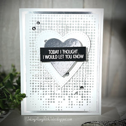
The dotted background is a crisp white in real life but looks
gray here thanks to my amateurish photography skills.

As you can see by my photo, the colors are all off. I used a silver metallic ink and a stencil to create the dotted background onto white cardstock which was then matted with silver metallic cardstock and adhered to a white card base. Onto the panel I layered a burlap die cut (white cardstock), two die cut hearts (one white, one silver), an embossed sentiment strip and silver rhinestones. The inside of the card says "how much I appreciate you." This may turn out to be hubby's non-valentine Valentine. :-)
Supplies:
Tim Holtz - Dot Fade stencil
Delicata - Silver Ink
Altenew - Burlap Texture die
Spellbinders - Jan 2017 DOTM
Neat & Tangled - Calathea stamp
Trinity - Silverstones
Thank you so much for spending a bit of your day with me.
Jules
.jpg)
.jpg)

I'm always glad to see you in the gallery! It's a lovely card, and it's easy to see how beautiful the metallic heart is! Love the sentiment as well. Thanks for playing along with us at Color Hues!
ReplyDeleteCool card, Jules! That dotted background really is so eye catching. As Karen mentioned, I love when I see your name pop up in any of my galleries. Thanks for squeezing in some time to play at Color Hues! Hugs!
ReplyDeleteI think it looks great in your photo, Julie! But better IRL, right? So fabulous!
ReplyDelete=]
Very cool card! I agree, hard to photograph metallic, but yours looks great! Thanks for sharing with us at Color Hues!
ReplyDeleteI think you did a great job with the photo, Jules. I love the crisp white, the silver schparkle, and all the layers of your sweet gratitude card for your hubby. Hugs, Darnell
ReplyDeleteYou did a great job with your card. I think the silver dotted background looks great and the silver and white hearts look perfect on it. Yes, it is hard to photograph metalic but yous does look great. TFS
ReplyDeleteHi, Color Hues friend! ;) This is a beauty with all the silver. And I am in total agreement, lovely to work with - a pain to try to photograph effectively.
ReplyDeletePopping in on your blog today to officially thank you for joining us again at color hues!
ReplyDelete(Already fell in love with you card over at Instagram! )
Julie I love the airy die cut you used for the background giving clues to all the silver behind. Thank you so much for sharing with us at the Color Hues!
ReplyDeleteI agree that it is frustrating to photograph anything with shimmer, shine or sparkle! Your card looks amazing in your photo though and I love that you've layered different textures of the white and silver and finished with that sharp black sentiment label. Who wouldn't melt if they received this card!! Vicky x
ReplyDelete